2016_17 martin kristek
čtvrtek 15. prosince 2016
f i n a l_m u s e u m_t o u l o u s e - l a u t r e c_e x t e n s i o n_a l b i
concept of extension of the museum building I set up on the game and the perception of space. the whole building is conceived as a kind of hidden secret volumes. extension is located below the surface of today's square and takes the character of the new space in the current space. I applied a similar principle also to the interior area of museum, where I used a minimalist volumes and once again put spaces into spaces. this basic idea I introduced conceptually with simple comparison to the volumes used in last american principles of designing office buildings - cubicle walls.
pátek 11. listopadu 2016
0 3 a l b i_a r c h i t e c t u r a l p r o j e c t d r a f t
Situation of the gallery is based
from the concept. Concept of gallery is divide the space to small squares,
connect streets for people, whose from the city and the tourists and make more
attractive public space, which is front of cathedral. The whole gallery is
situated underground because the catherdral is sacred and dominant in this
space for us. The entrance of gallery is located from the courtyard of the
Toullouse-Lautrec museum to preserve the connection with museum since it is an
extension. It provides
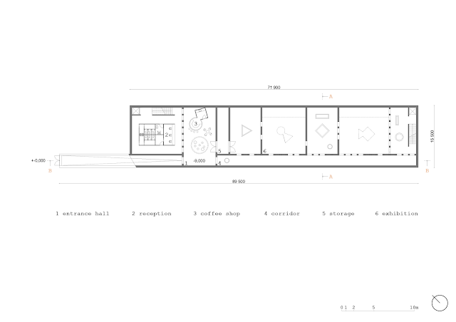
easy access from one exhibition building to another. The gallery has 1160 sqm. In this volume are
included the functions like space for exhibition, coffee shop, bookshop,
conference hall, rest rooms and storage for exhibition.
In the first floor plan is
situated ramp, which fluent connect entrance of gallery to entrance hall. The
entrance hall got a function like a little square in gallery. When you can
read the book, buy the coffee or just take a rest. There's corridor which
connect open entrance hall with exhibition spaces. The corridor is an
instrument of orient in the mess of walls in exhibition spaces.
To the second floor we reach by the stairs or by the elevator for immobile people. There are conference hall for 50 people and the other place for exhibition.
In the cross section it is shown
that we create a different atmosphere in the gallery space. Last time we talked
about the difference between the atmospheres inside the cathedral and outside
at the square. Now we created another atmosphere, in our eyes somehow similar
to the cathedral atmosphere. There is shown how the skylights pass through the
floors and create kind of sacred quite atmosphere.
In the interiors facade it is
shown scale and dimension of holes, the texture of material on the surface.
Simple layout and spaces influenced us in the choice of material. The
material which with we make in interior is concrete.
We are thinking our museum extention not very like an usually building but more like piece of art. Stuffs of art, we can call them architecture statues or little monuments situated at the extention space will support the sublime meaning of building. We used the concept of very minimal entrances created by raw materials or pure smooth structures, which do not disturb the space in front of nowadays museum, but by this gate promote them and give space a noble level. Also we want to make a little contrast between original and new.
Our group work is applicated only into the entrance spaces from the start of the declining ramp to the start of exhibition space. The other design of this spaces will be individual to the each of us. We make an expoded axonometry section which showed us the consistency between of the upper levels - from the entrance hall with coffeeshop through the level with ticketshop, bookshop, locker room and toilets to the level over with conference hall. And also the skylights are presented here like the specific point of our concept; which penetration to the ground creates this little change of public space at Place Sainte Cécile.
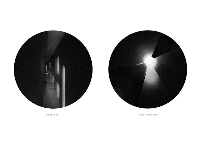
From start of the project, we were still thinking about the atmospheres inside of the museum. We knew that we had to build under the ground because of the holy space in front of the catherdral. So we design very modest interior space created by pure concrete and raw surfaces which are supported by the contrasted atmospheres of light and dark. The skylights rising from the ceilings will create the play with sun and shadows. Without the useless descriptions and pointers in interior we wanted give to visitor some feeling, how our space works and how should behave in.
We had to solve the volumes in our exposition space. Our exhibition walls will be created just by the skylights which, not all of them, will connect and going through the double foor - with the reason to bring a light or to create next exhibition walls. Some volumes will not be only for light, but could be hollow and create the next intimate and quiet spaces of gallery.
All of our used elements in the museum we think like a support of feels between the scale of human and monumental space of gallery.
The prints of light at the walls and floor emphasize atmospheres in space and also create simple marks which helps the visitor with the orientation in exhibition spaces. Monumentality of entrance spaces is supported by increased level of arcs.
pátek 28. října 2016
0 2 a l b i_i d e a & c o n c e p t
In order to talk about the concept it was important to look at the connections at the site. Firstly we needed to find the right size and volume for our building. In the scheme we show our process of thinking, we started out with showing the borders and the maximum space we could use. The maximum for us, was defined by borders of the square in the floorplan and by the height of the cathedral size wise. Then we started to cut the volume down slowly to find the right position and size. We lowered the maximum height considering we do not want to make competition to the majesty of cathedral, we want to preserve the monumental feeling. Next we cut the volume in size from the west side of the square since we wanted to leave some free space infront of the apsid not to change its look and perceiving. Reason to cut the volume from the east came up when we looked through historical plans and analysed them. We could clearly see, that the big open space on front of the apsid is quite new, and there was always block of buildings leaving only small square area for the market. We choose to follow this axis and leave the market square empty. In the end we cut the volume to the final form to a narrow rectangle, to preserve the free space in front of the cathedral and also to preserve the relationships between streets. This way we can add value to both squares.
When working with such historic area, we needed to agree on our opinion how to work with it and in it. One thing we realised was, that heritage area is very untouchable for us. We do not want to change it. It was quite interesting thought for us, that there is a metaphore in how similar this is comparing with nature. Both worlds very untouchable and beautiful.
We thought about how we can implement this into the square. The idea started with what happens if we put for example a wall in the middle of the square. How does it change the perceibing of the square and space. With a simple scheme we show, that the difference between perceiving before and after putting the wall is huge. Especially talking about the cathedral, which is the main point of interest when looking at the square. Suddenly the cathedral can not be seen copletly and clearly and you wonder, what is behind the wall? also the small opening changes the flow of the square, people have to go around or as a mass through the opening. A very small structure/object changing the perceiving of a very well known scene largly.
So the remaining question was, how can we do this with our volume? To apply the concept, but use our building as the object. Clearly the volume was too big. It would change the place too much which was not our goal. We put the building underground, which reduces the volume and use small parts of the building peeking throught the surface. The parts visible will act as our statues to change the perceiving of the space. Visible parts are skylights bringing the light to the gallery and they leave a small footprints and hints of our building on the surface.
When looking at the sections, there is a connection between the square and the underground building made by skylights. The two areas overlap by changing level of the ground. The entrance we located from the courtyard of the Toullouse-Lautrec museum to preserve the connection with museum since it is an extension. It provides easy access from one exhibition building to another.
In the cross section it is shown that we create a different atmosphere in the gallery space. Last time we talked about the difference between the atmospheres inside the cathedral and outside at the square. Now we created another atmosphere, in our eyes somehow similar to the cathedral atmosphere. They share this kind of sacre quite atmosphere.
When thinking about the functions and programme of the building, we needed to find the relationships between each of the spaces. In this scheme we show what the relationships look like to us, how they connect.
We started to think about the order of the functions and how to make the layout in the building. In order to find the right layout we put the functions next to each other and looked at the proportions they represent. Next we prosposed multiple options of the combinations, but we agreed the final option will be chosen individually in further process.
Přihlásit se k odběru:
Komentáře (Atom)


