Situation of the gallery is based
from the concept. Concept of gallery is divide the space to small squares,
connect streets for people, whose from the city and the tourists and make more
attractive public space, which is front of cathedral. The whole gallery is
situated underground because the catherdral is sacred and dominant in this
space for us. The entrance of gallery is located from the courtyard of the
Toullouse-Lautrec museum to preserve the connection with museum since it is an
extension. It provides
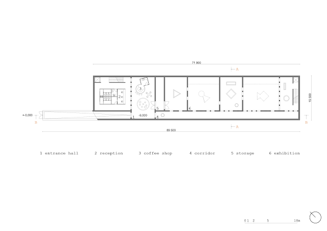
easy access from one exhibition building to another. The gallery has 1160 sqm. In this volume are
included the functions like space for exhibition, coffee shop, bookshop,
conference hall, rest rooms and storage for exhibition.
In the first floor plan is
situated ramp, which fluent connect entrance of gallery to entrance hall. The
entrance hall got a function like a little square in gallery. When you can
read the book, buy the coffee or just take a rest. There's corridor which
connect open entrance hall with exhibition spaces. The corridor is an
instrument of orient in the mess of walls in exhibition spaces.
To the second floor we reach by the stairs or by the elevator for immobile people. There are conference hall for 50 people and the other place for exhibition.
In the cross section it is shown
that we create a different atmosphere in the gallery space. Last time we talked
about the difference between the atmospheres inside the cathedral and outside
at the square. Now we created another atmosphere, in our eyes somehow similar
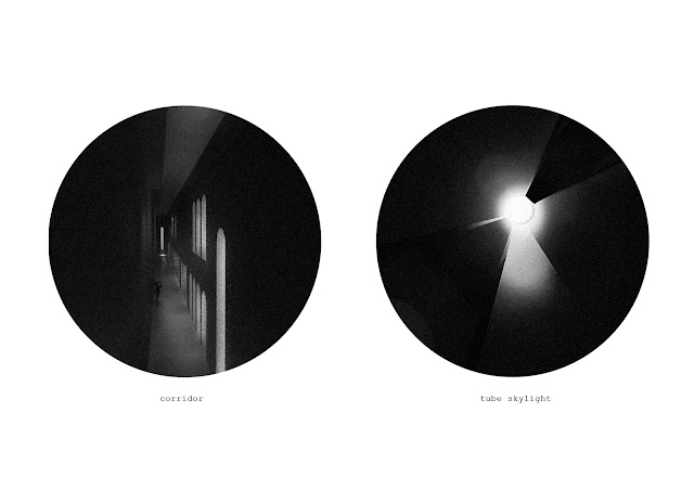
to the cathedral atmosphere. There is shown how the skylights pass through the
floors and create kind of sacred quite atmosphere.
In the interiors facade it is
shown scale and dimension of holes, the texture of material on the surface.
Simple layout and spaces influenced us in the choice of material. The
material which with we make in interior is concrete.
We are thinking our museum extention not very like an usually building but more like piece of art. Stuffs of art, we can call them architecture statues or little monuments situated at the extention space will support the sublime meaning of building. We used the concept of very minimal entrances created by raw materials or pure smooth structures, which do not disturb the space in front of nowadays museum, but by this gate promote them and give space a noble level. Also we want to make a little contrast between original and new.
Our group work is applicated only into the entrance spaces from the start of the declining ramp to the start of exhibition space. The other design of this spaces will be individual to the each of us. We make an expoded axonometry section which showed us the consistency between of the upper levels - from the entrance hall with coffeeshop through the level with ticketshop, bookshop, locker room and toilets to the level over with conference hall. And also the skylights are presented here like the specific point of our concept; which penetration to the ground creates this little change of public space at Place Sainte Cécile.
From start of the project, we were still thinking about the atmospheres inside of the museum. We knew that we had to build under the ground because of the holy space in front of the catherdral. So we design very modest interior space created by pure concrete and raw surfaces which are supported by the contrasted atmospheres of light and dark. The skylights rising from the ceilings will create the play with sun and shadows. Without the useless descriptions and pointers in interior we wanted give to visitor some feeling, how our space works and how should behave in.
We had to solve the volumes in our exposition space. Our exhibition walls will be created just by the skylights which, not all of them, will connect and going through the double foor - with the reason to bring a light or to create next exhibition walls. Some volumes will not be only for light, but could be hollow and create the next intimate and quiet spaces of gallery.
All of our used elements in the museum we think like a support of feels between the scale of human and monumental space of gallery.
The prints of light at the walls and floor emphasize atmospheres in space and also create simple marks which helps the visitor with the orientation in exhibition spaces. Monumentality of entrance spaces is supported by increased level of arcs.


Žádné komentáře:
Okomentovat